
Monsoon Fashion eCommerce Website Redesign


Modern Tech Stack

axure

Figma

proto.io

salesforce

Sketch
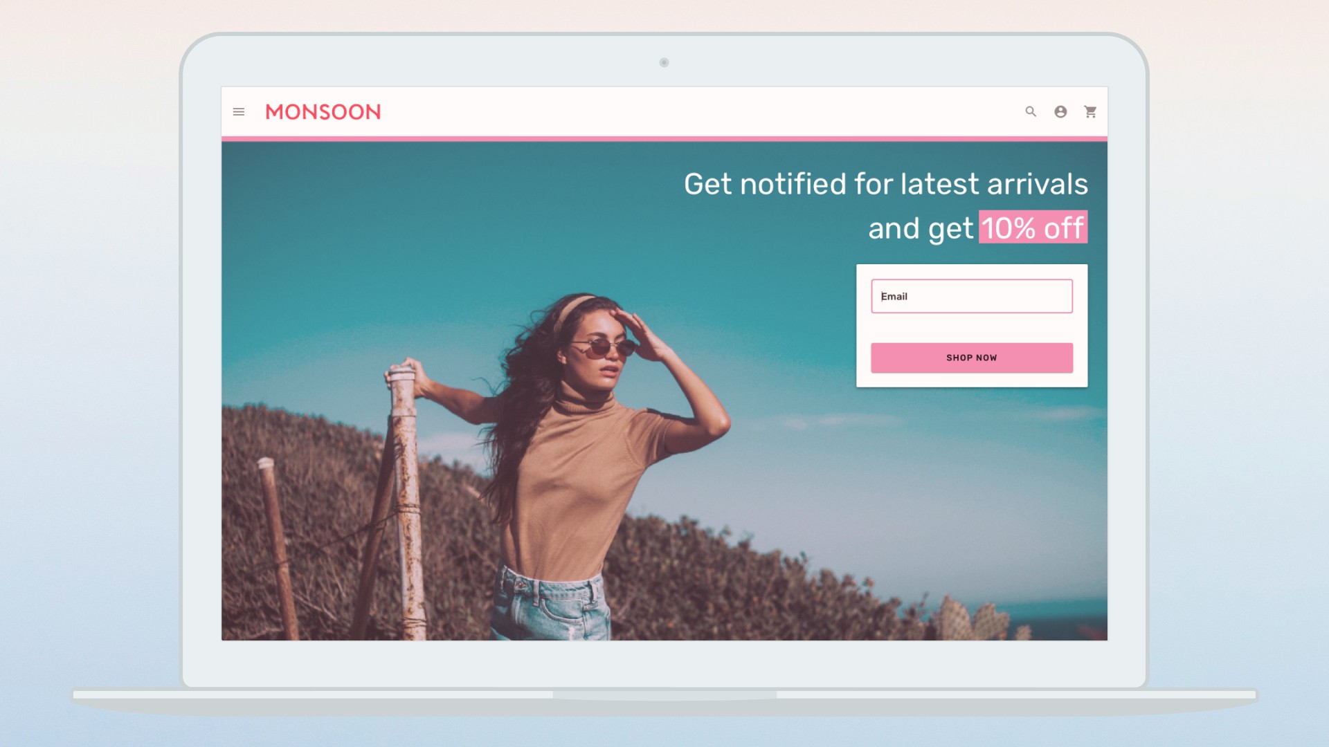
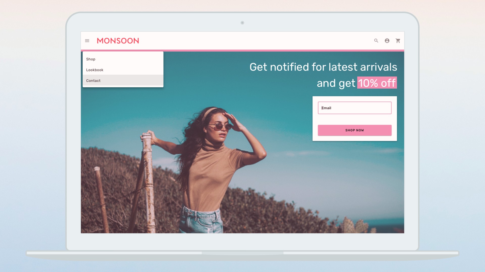
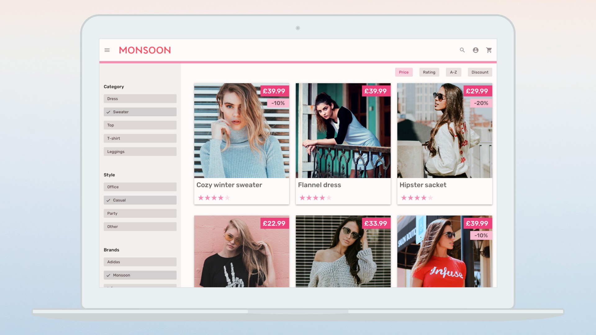
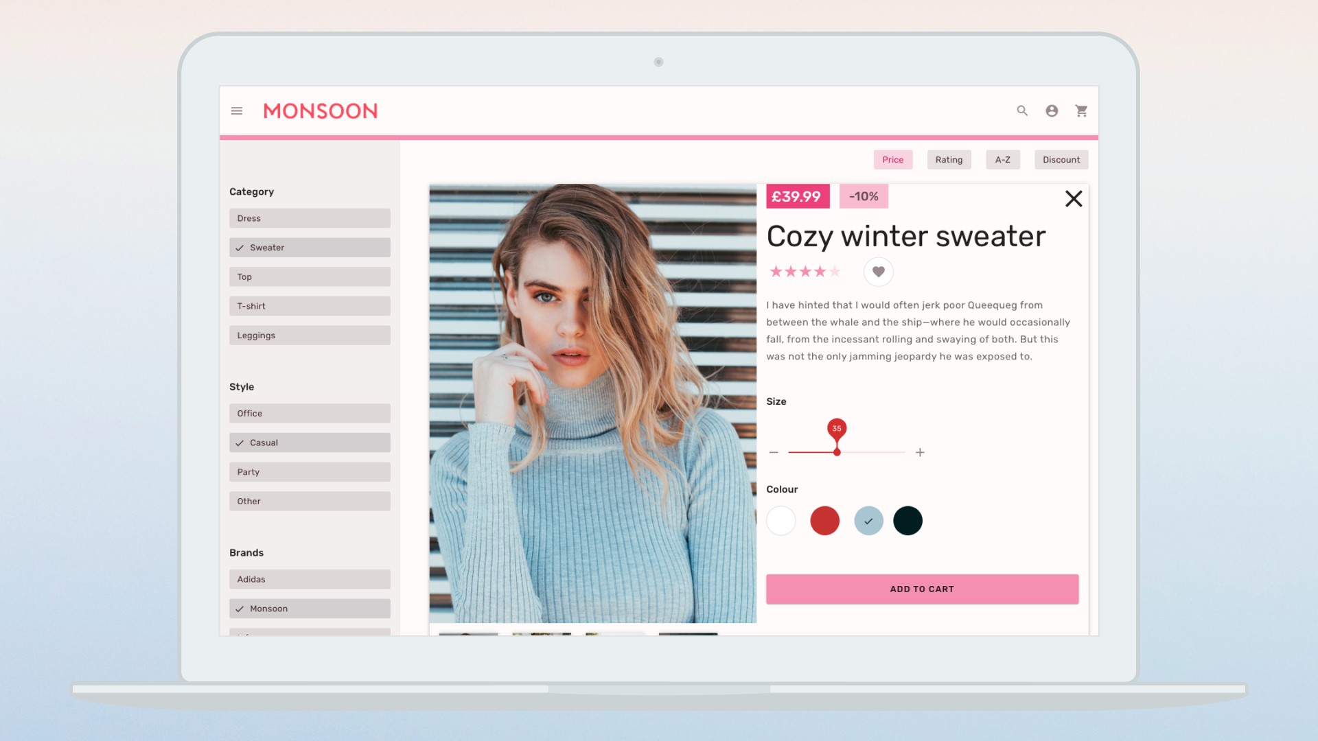
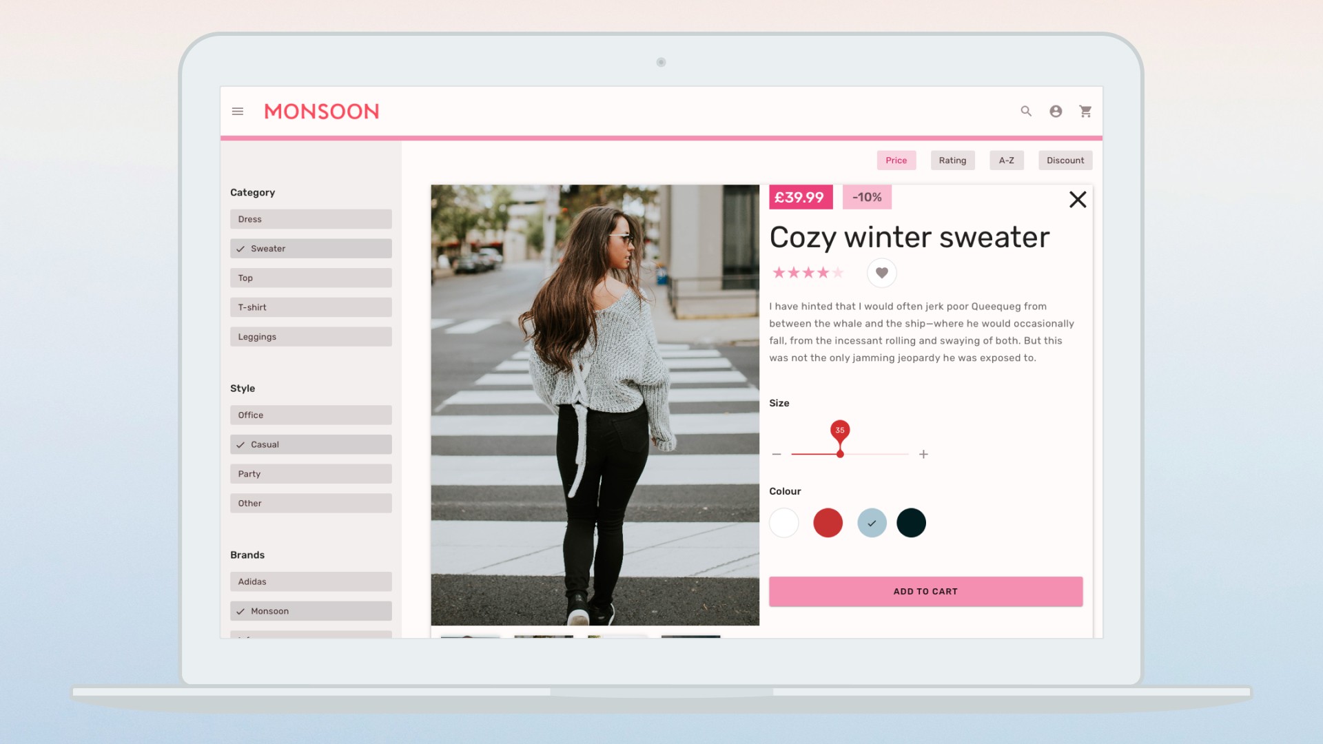
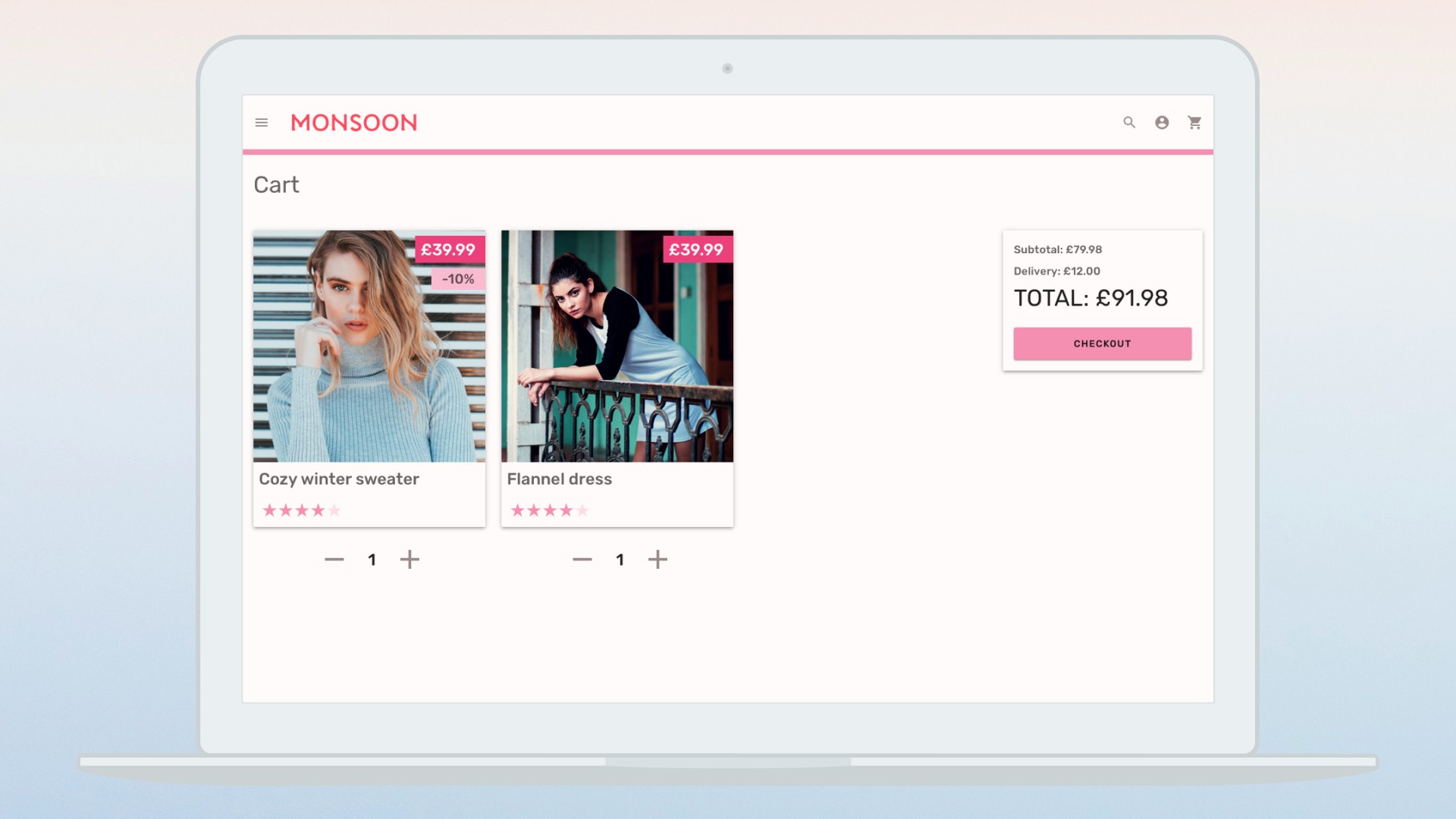
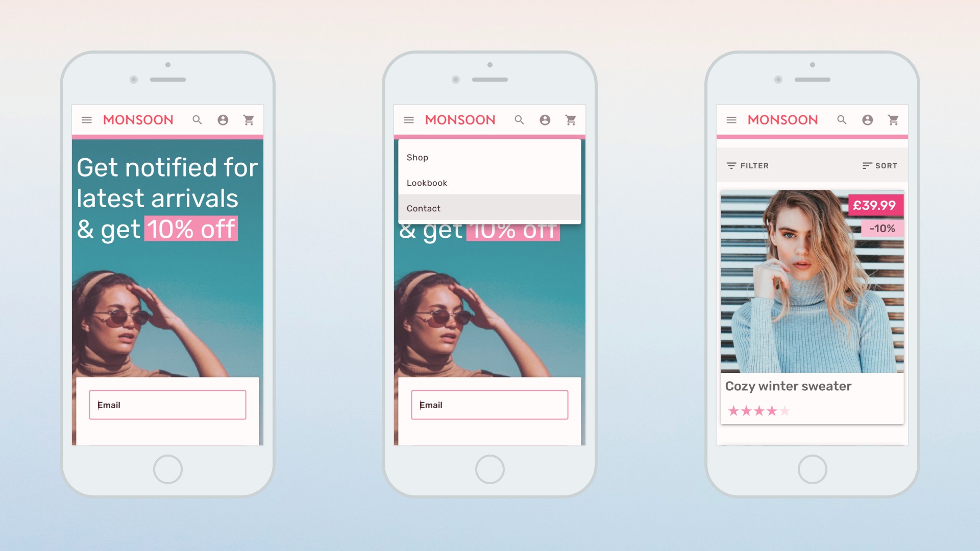
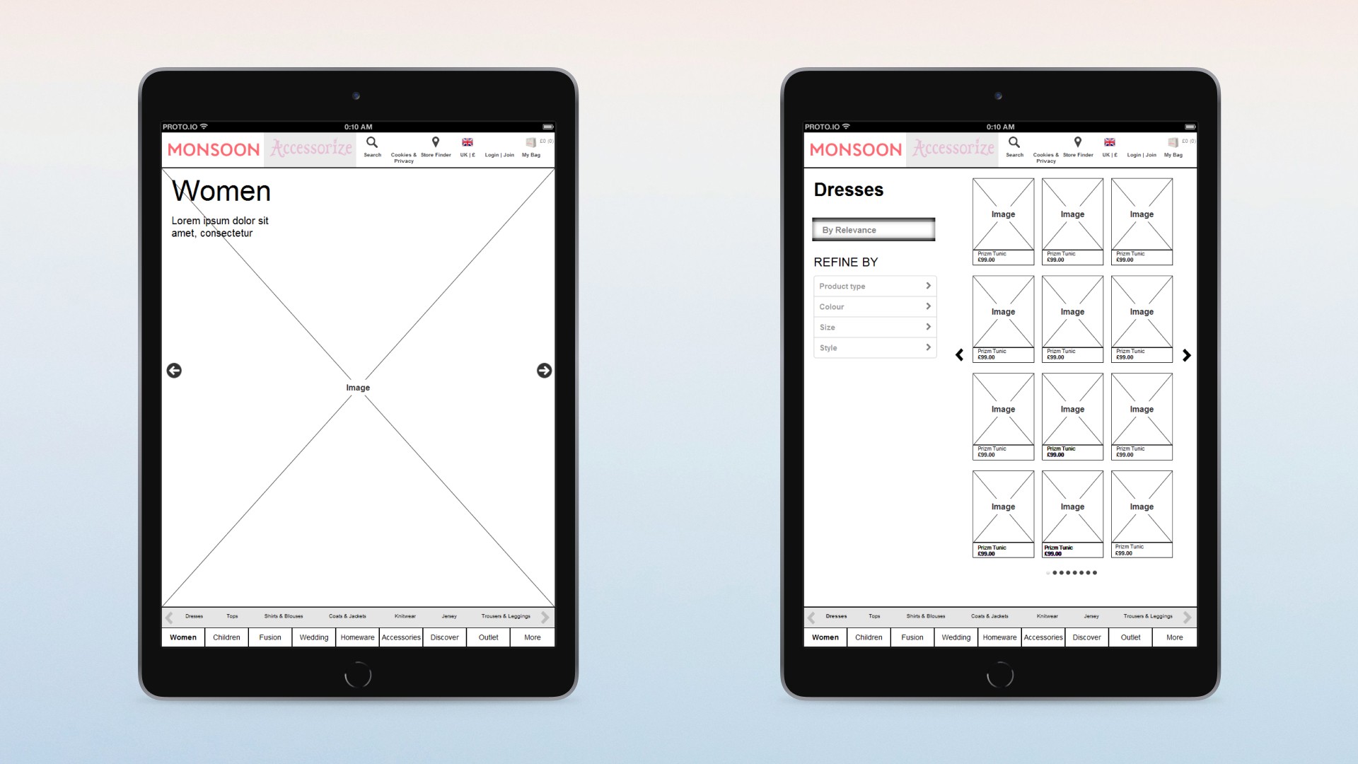
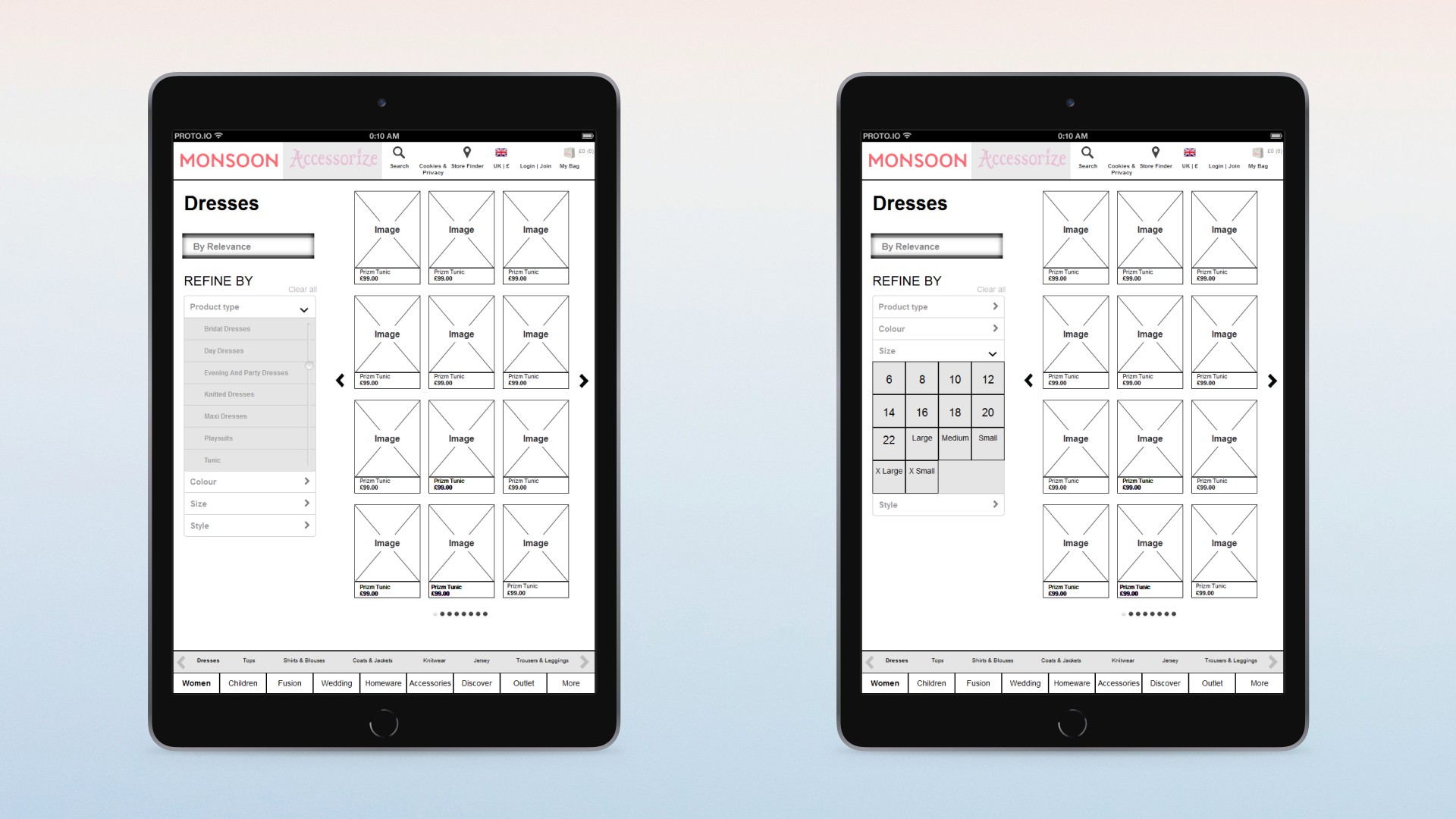
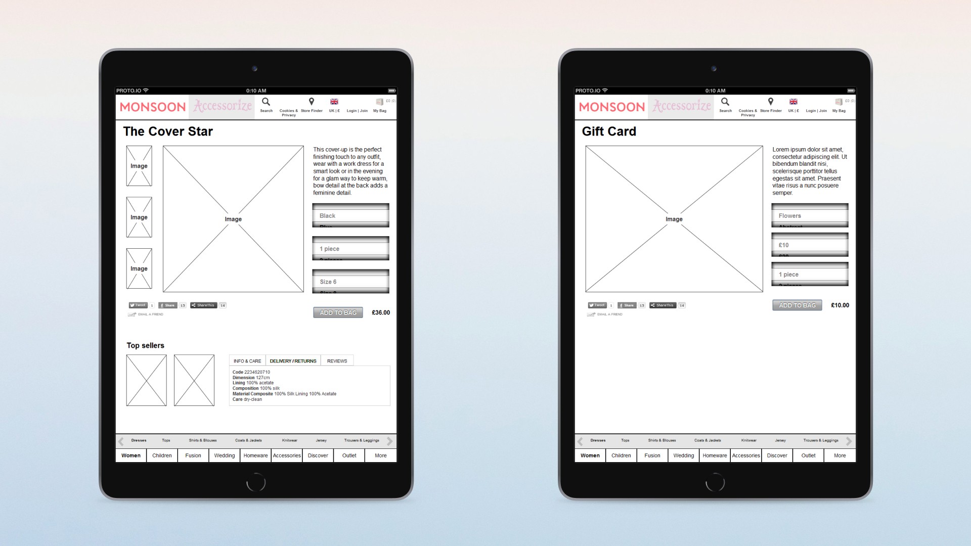
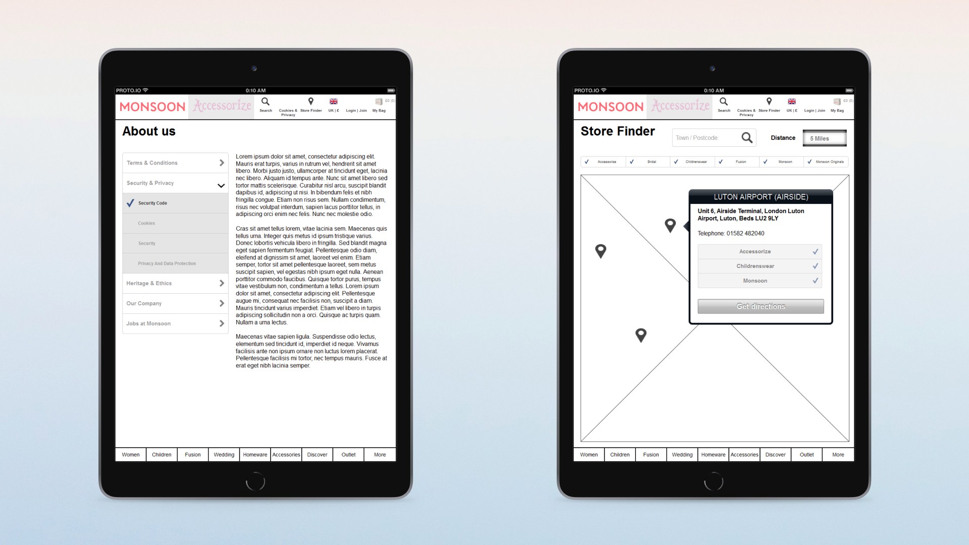
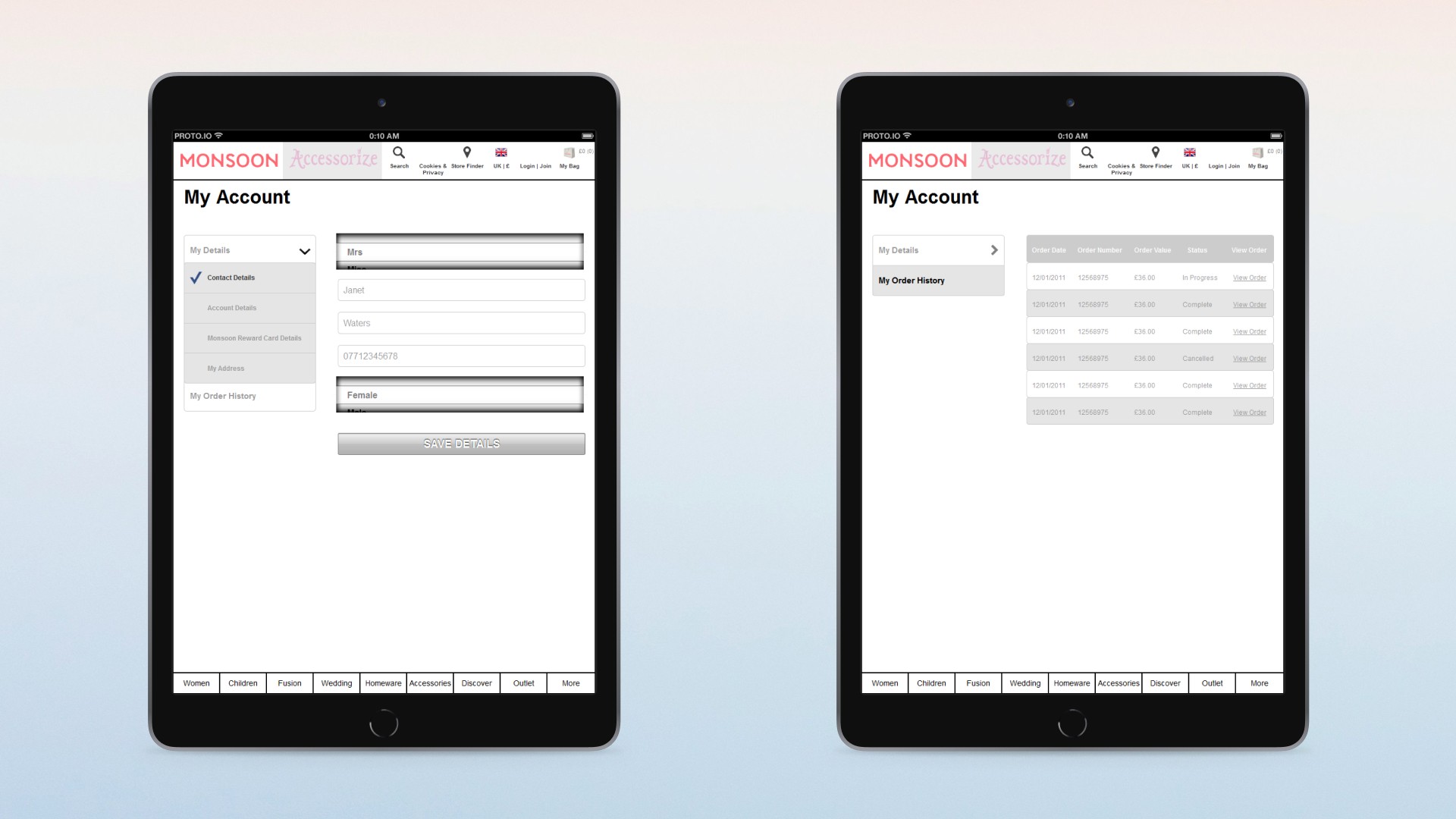
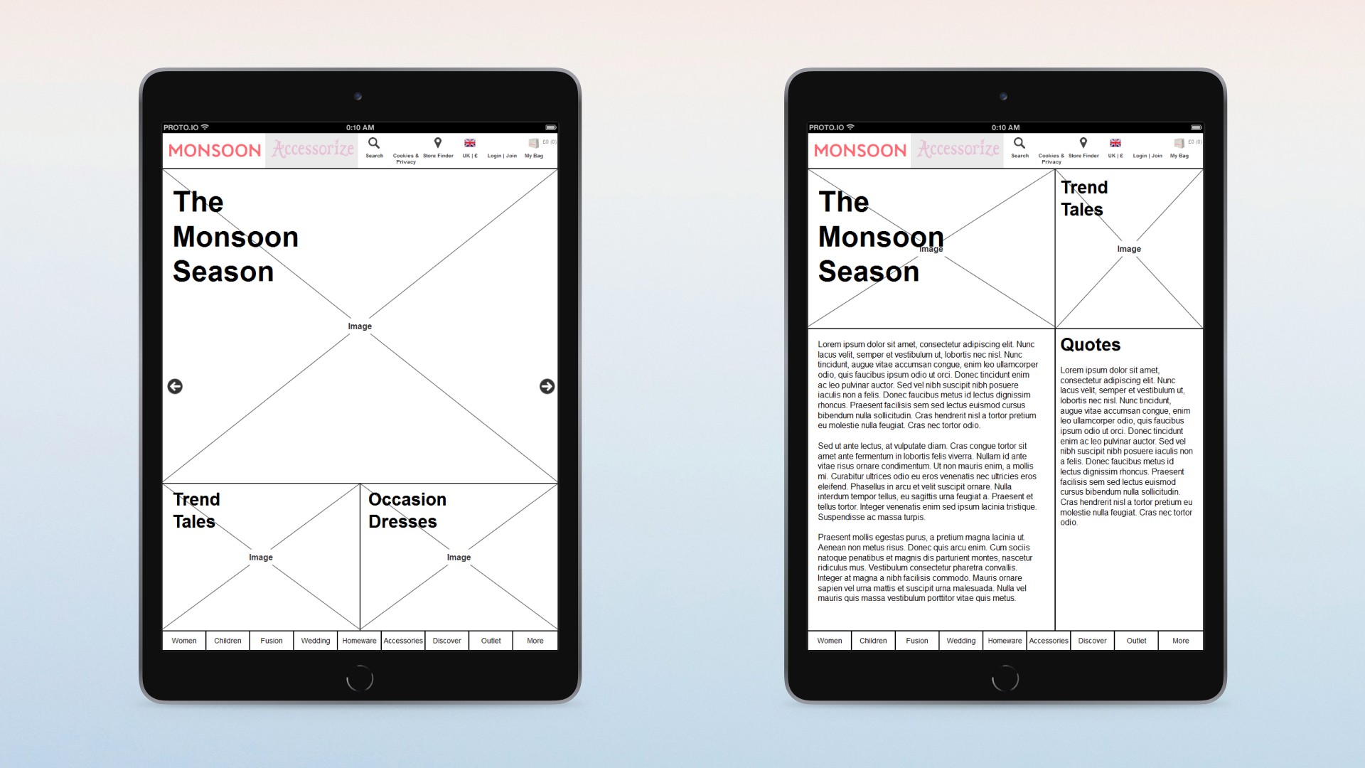
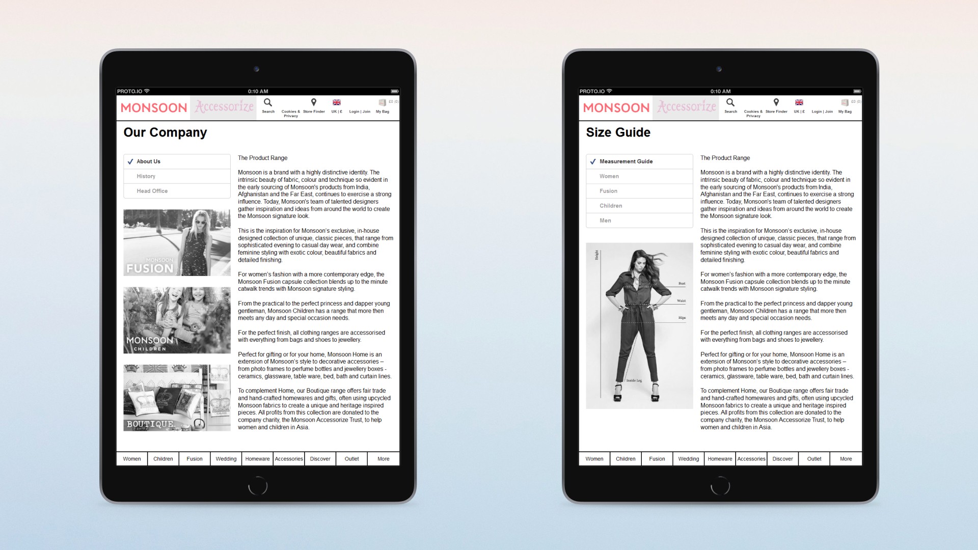
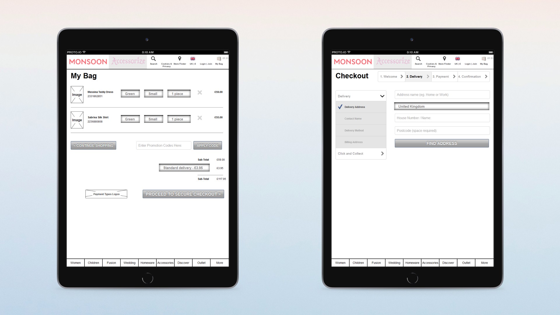
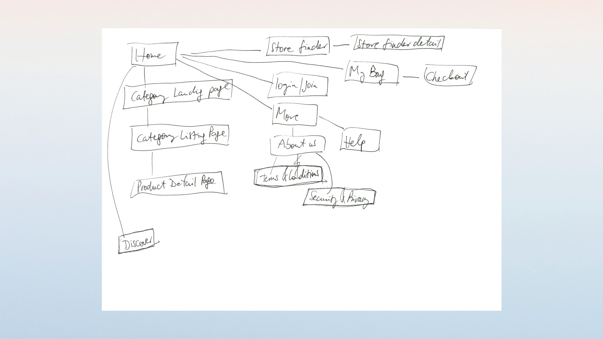
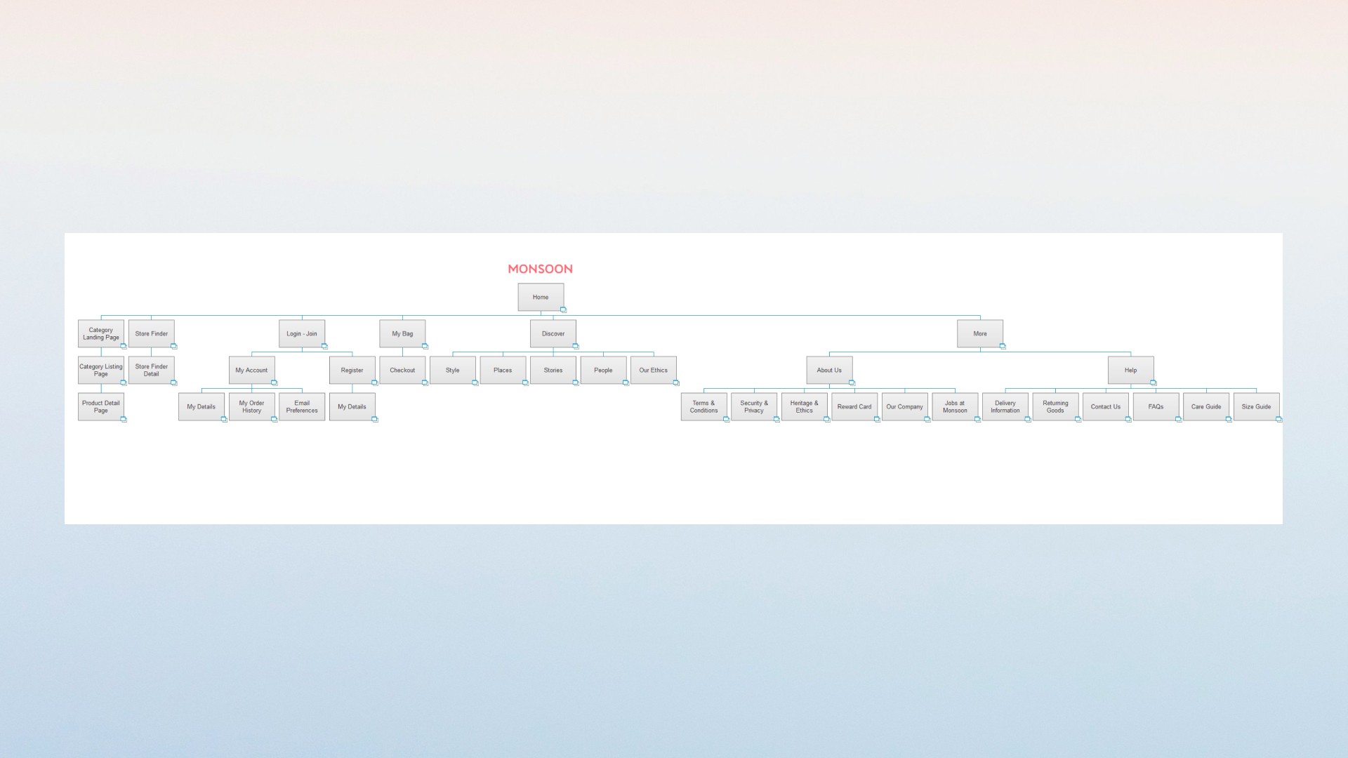
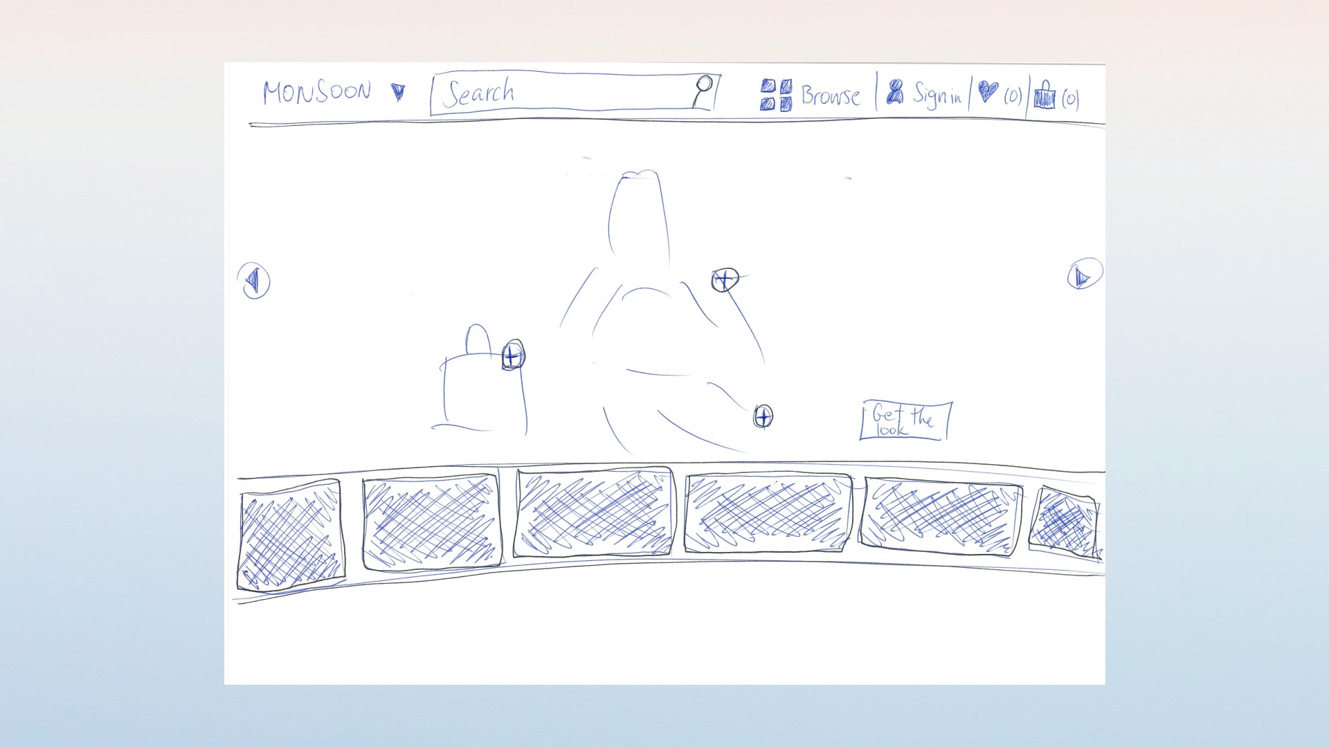
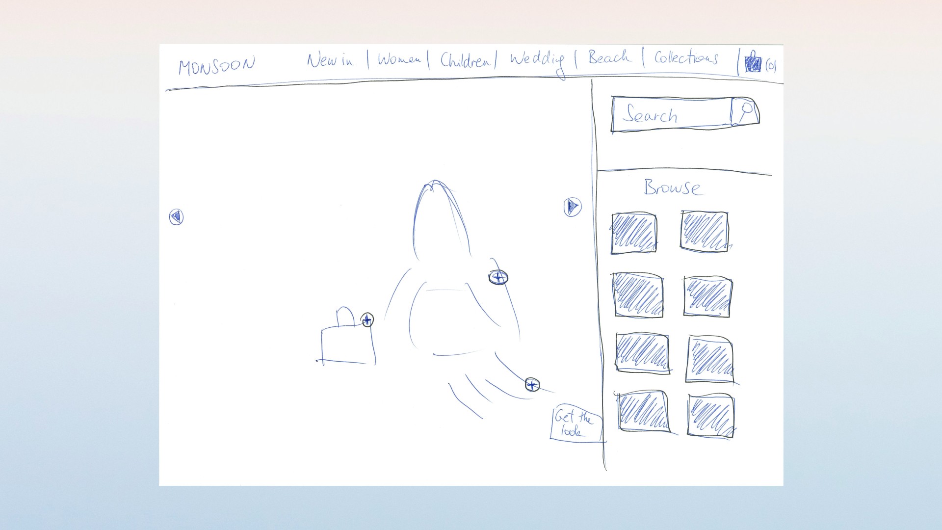
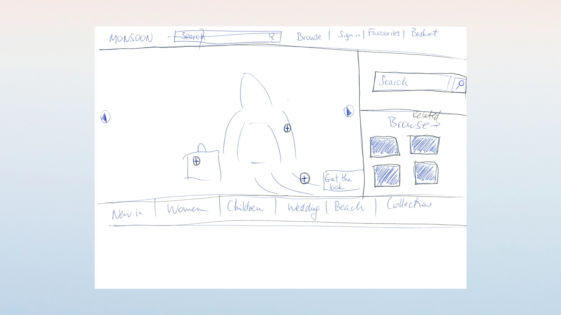
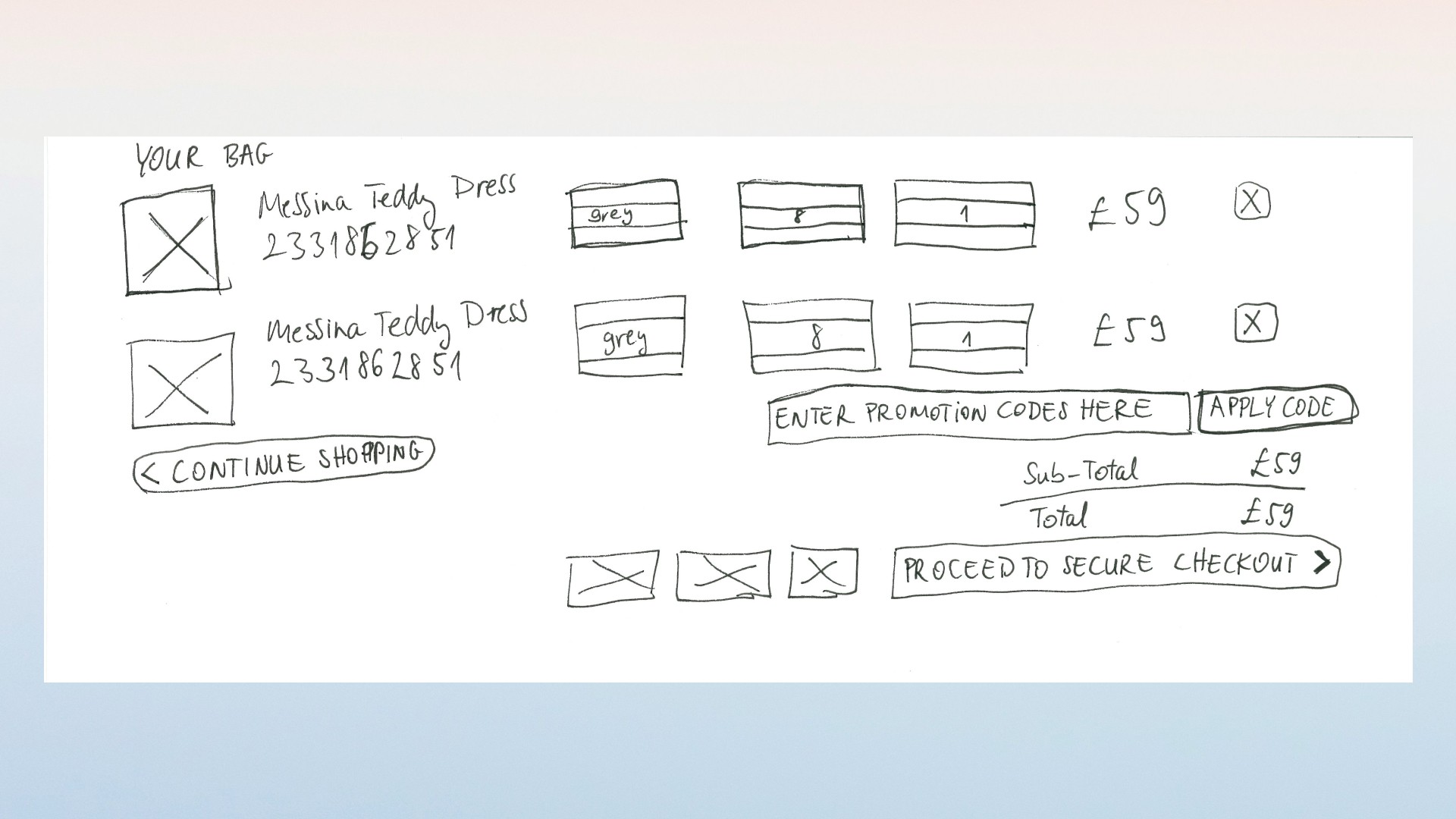
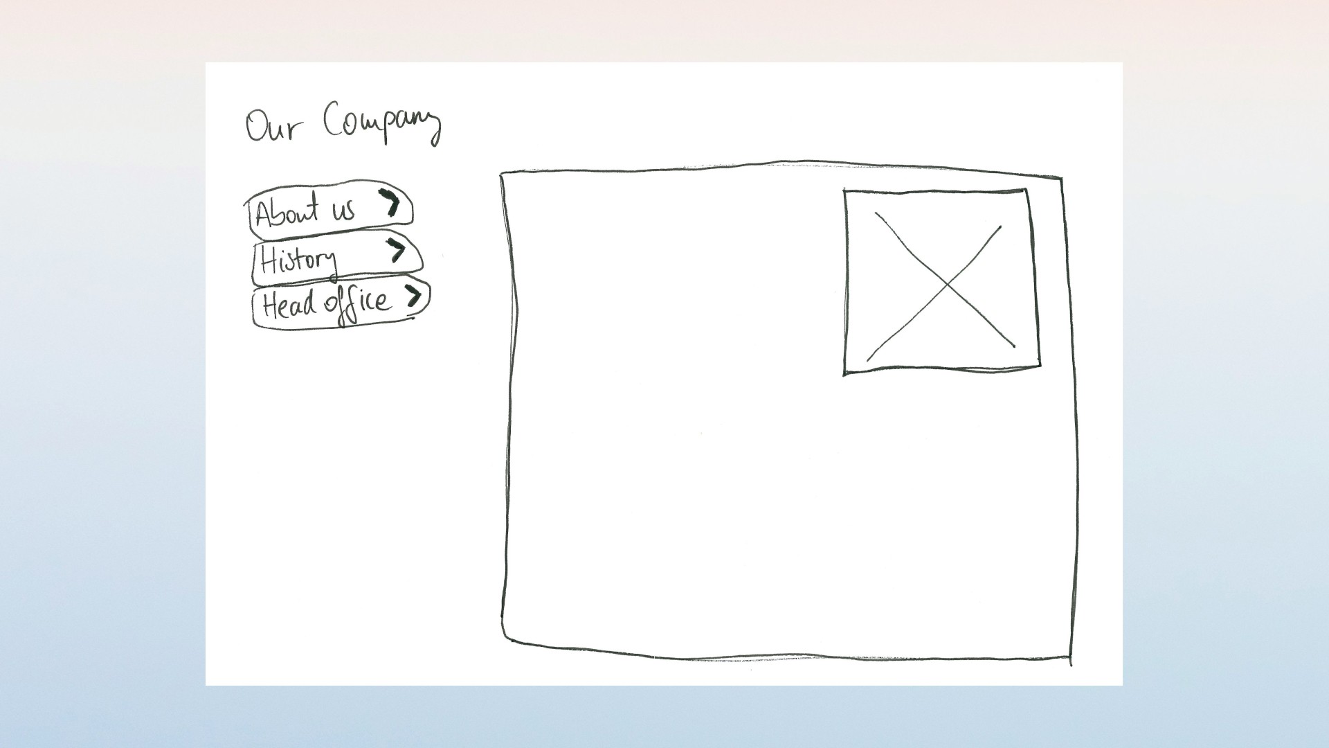
Monsoon is a British fashion brand with a sister brand in the same group. The live tablet storefront already sold the range, but the path had not stayed coherent as the catalogue grew.
They wanted shoppers to move from home to listing to product to store finder without fighting the taxonomy.
Collaboration: Reply (UI)
Objective
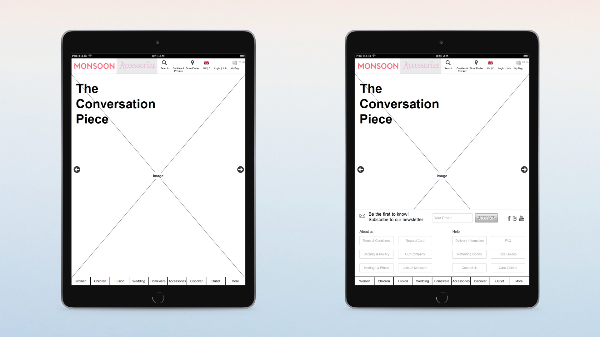
Keep women, children, the sister brand, bag and stores in one header.
Make category, listing and product a single spine instead of a campaign page plus a leftover catalogue.
Keep click and collect next to add to bag, and keep store finding inside the same chrome.
Approach
UX design and information architecture for tablet ecommerce: home as a campaign hero with room for supporting collections, not a second site.
Category landing with a persistent left rail into listing, then product.
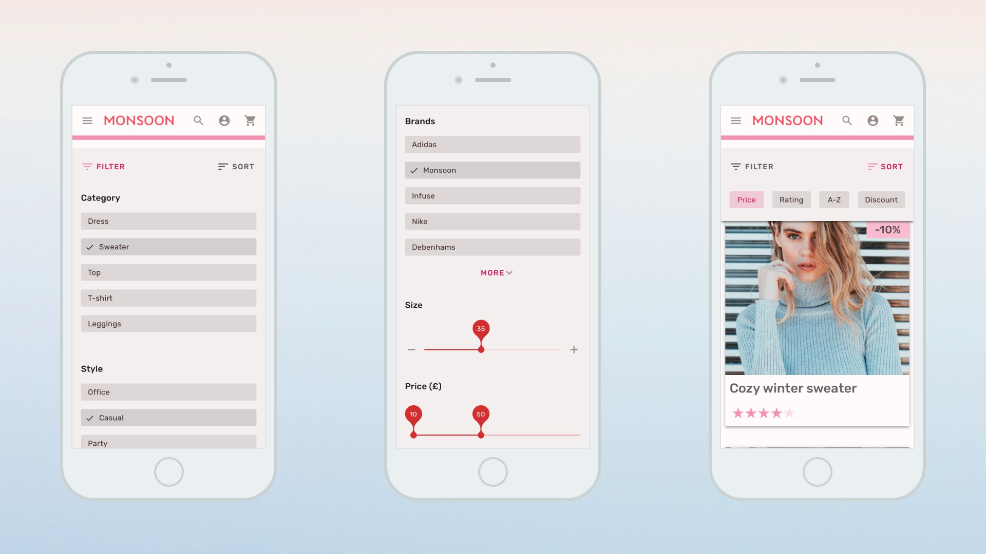
Listing filters for type, colour, size and style so the grid is shoppable without a new microsite per drop.
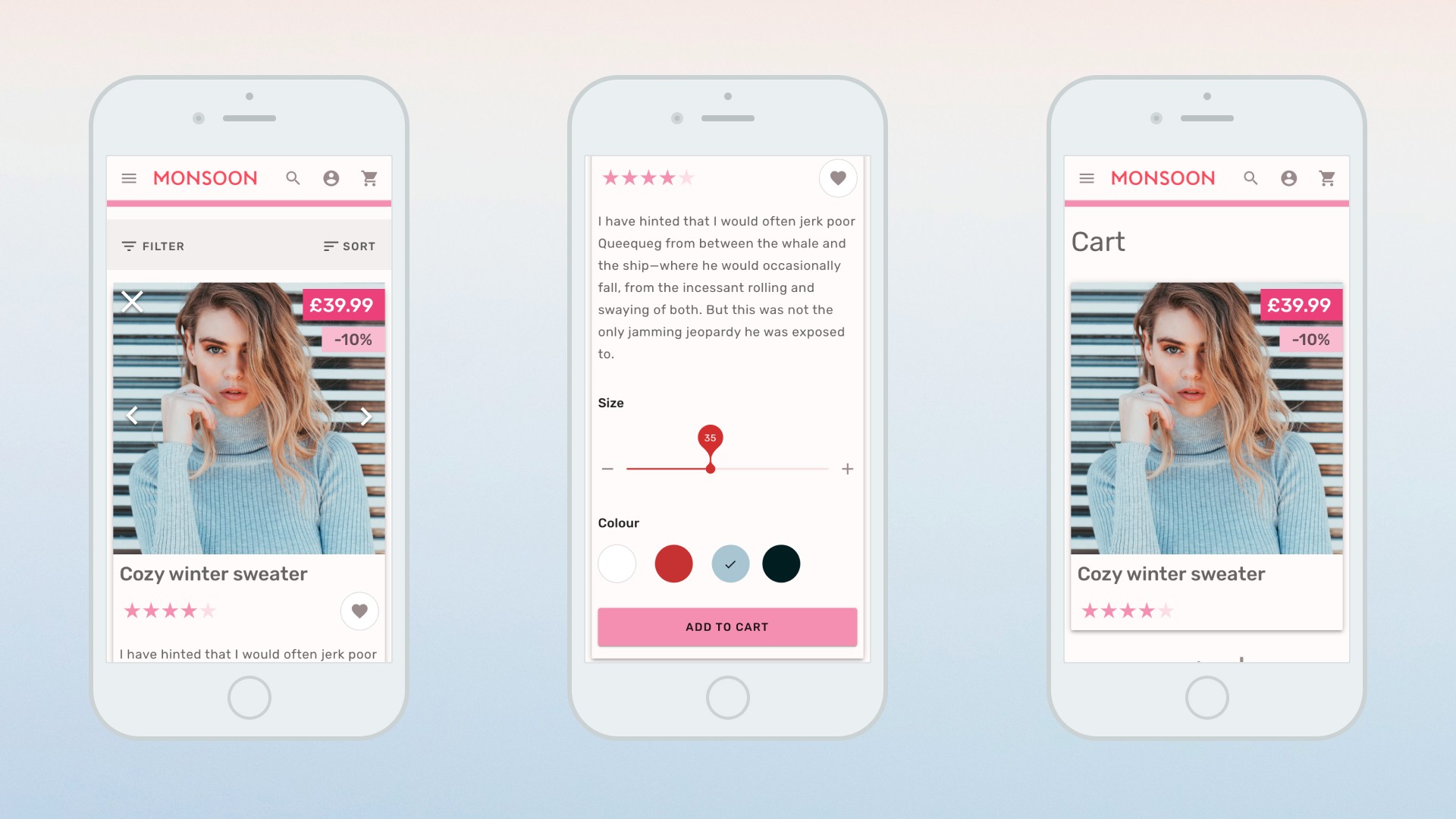
Product page with gallery, options, add to bag and click and collect on one surface. Care, delivery and reviews sit in tabs, not in the fold.
Store finder as postcode, distance and map, with filters for the brand family so a shopper can see which fascia is nearby.
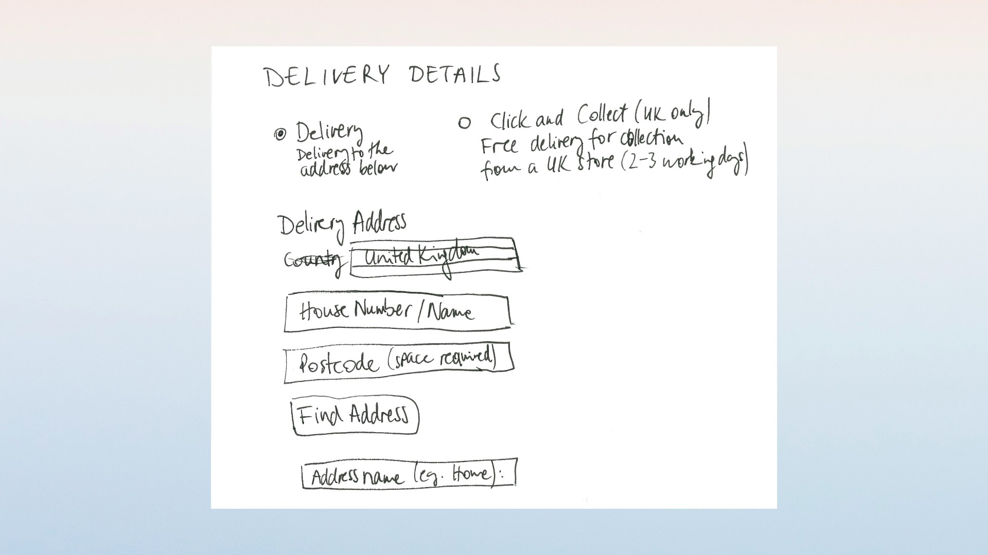
Account, bag and four-step checkout on the same tree.
Portrait and landscape of the same templates, because this work was for tablet.
Impact
The catalogue has a listing-to-detail spine again.
Sister brand, collect and stores sit inside one chrome instead of three leftovers.


